
Bottle art is serious business at Stone. Great beer without great packaging would be like presenting filet mignon and lobster on a trashcan lid. Fortunately, we have incredible artists on our team, plus writers (and a CEO) to pen short novels on the backs of our bottles, all of whom are Worthy of the beers whose virtues they promote. These individuals are more than capable, but when it came time to develop designs for a beer released in connection with celebrities and around the same time as San Diego’s annual Comic-Con—Drew Curtis/Wil Wheaton/Greg Koch Stone Farking Wheaton w00tstout—we decided to go above and beyond, crafting three unique bottles that have become collector’s items among beer fans, thanks to three gifted and diverse artists.

Like the beer itself, which was conceived and brewed up by Stone CEO Greg Koch, actor and Internet sensation Wil Wheaton, and Fark.com creator Drew Curtis, the artistic component was a collaborative effort in which a trio staked out on a quest to bring their own unique take on the glass receptacle that would house this wheat-, rye-, pecan-, and whiskey-tinged imperial stout. Two hail(ed) from Stone, while the other enjoys wide-ranging acclaim as a top notch comic book artist, and all of them knocked this undertaking out of the park!

The initial design for this bottle was actually developed back in winter when Stone Graphic Artist Jade Blessinger and her Art Department colleagues put together a design that would go on to grace all of Stone’s 2013 collaboration beer bottles. This design replaced a loose concept that was used in previous years. “We collectively decided that, since the collaboration beers are a celebration of creativity, the bottles should be festive,” says Blessinger. To accomplish that, vivid colors were brought into the equation to replace a majestic, but a bit monotone, gold that had been the previous collaborations’ calling card. Blessinger and company also evoked the ingredient most highly utilized in the manufacture of boldly bitter beers—the hop. “The design includes a floral hop crest reminiscent of medieval heraldry,” she says. “It’s highly illustrative and carries a lot of detail and organic elements—perfect for beers with lots of complex flavor profiles!”

Blessinger’s departmental cohort, former Graphic Artist Jeff Perkin (former only regarding Stone, since he left us to design for skate-surf apparel company, RVCA, but not before killing it for us on this bottle), was tasked with creating a secondary bottle design that played off the geek idol nature of the collaborators as well as the spectacle of Comic-Con. His solution was churning out a design that included busts of each collaborator drawn up as superheroes. “I researched different superheroes and was going for quirky, old-school characters as opposed to modern day, polished characters,” says Perkin. “Wil Wheaton is supposed to be more of a villain, like The Riddler; a narcissist with a flair for detail, hence the Ws cut into his hair and on his mask. The Fark dude has a cool, tight, top-o’-the-head mask with the Fark map to tie in who he actually is. (Props to Stone Creative Director Mike Palmer for that idea.)” And for Koch? “Greg already had a lot going on for him with the beard, so a mask didn’t seem appropriate. He’s a vintage Superman type character. Hence the gargoyle logo on the chest.”

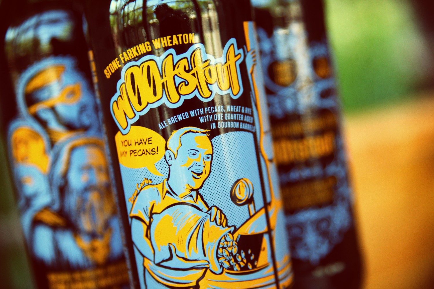
And since Comic-Con is based around comics, it was only appropriate that we bust out a third bottle with a comic strip on it. For that specialized assignment, we sought out someone who does comic illustration for a living, artist Joel Watson. Best known as the guy behind HijinksEnsue, Watson was recommended by Wheaton, who is a friend and big fan of his work. Watson put together a connected three-panel piece (at the suggestion of Wheaton) that shows all three collaborators around the brew kettle, adding their signature ingredients to the boil. Curtis exclaims, “You have my pecans!” Wheaton follows suit with a word balloon filled with, “And my wheat!” The comic concludes with Koch tossing up alpha acid-laced buds and triumphantly yelling, “And my hops!” Upon submitting his first draft, Watson was expecting a lot of edits, and was pleasantly surprised when the only notes that came back were to make Koch’s beard look more disheveled and change the text so Curtis wasn’t saying, ‘You have my nuts!”

United by talent and a most unique craft beer project, three different artists came up with three wholly different designs, but in the end they are all works of art, and something both we and our fans will be happy to hold on to as some of the best beer art in Stone’s illustrious illustrated history.
Add new comment